Fun packaging design in beauty and why playful packs are getting serious
a[data-rs-seo-link]{text-decoration:underline!important;color:#1a56db!important;cursor:pointer!important;}a[data-rs-seo-link]{text-decoration:underline!important;color:#1a56db!important;cursor:pointer!important;}
Fun packaging design is becoming a practical beauty strategy
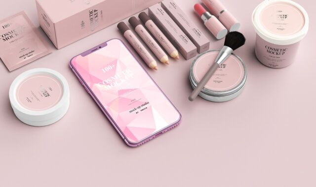
Fun packaging design in beauty has moved beyond novelty. Bright colour, unusual forms, tactile finishes, collectible details and playful copy can help a product stand out on shelf, look stronger in a social feed and stay in the shopper’s memory. The best examples, however, are not simply loud or cute. They still protect the formula, explain the product clearly, work in daily use and fit the brand’s sustainability responsibilities.
For beauty brands, the opportunity is straightforward: playful packaging can create emotional appeal in categories where many formulas, claims and formats look similar. The risk is equally clear. A pack that looks entertaining but feels wasteful, confusing or impractical can weaken trust quickly. This guide looks at what makes playful packaging effective, where it can go wrong, and how beauty brands can use it with more discipline. For more packaging analysis, explore our Packaging Design section.
Why playful beauty packaging is gaining attention
Beauty packaging has always carried more than functional information. It signals price, identity, lifestyle and ritual. What has changed is the number of settings in which packaging now has to perform. A lipstick, serum or fragrance pack may be judged in a shop, on an e-commerce product page, in a short-form video, in a creator’s unboxing clip and on a bathroom shelf. A playful pack is often designed for several of those moments at once.
Industry sources have repeatedly linked younger beauty discovery with visual and social platforms. NielsenIQ has described Gen Z as especially comfortable with beauty discovery and shopping through TikTok and Instagram. Global Cosmetic Industry has also noted that social platforms have become important destinations for beauty inspiration and education. In that context, a compact, jar, tube or carton that photographs well can act as a small media object, not just a container.
This does not mean every product needs cartoon graphics or an exaggerated silhouette. Fun can be subtle. A skincare refill can use a satisfying click mechanism. A fragrance carton can reveal a colour story when opened. A lip product can use an unexpected cap shape that is recognizable in a handbag or on camera. The common factor is memorability linked to use, not decoration added at random.
What makes packaging feel fun without becoming gimmicky
Playful packaging usually works through a mix of visual, tactile and behavioural cues. Strong designs choose a few cues and repeat them consistently instead of adding every possible attention device.
Colour with a clear job
Colour is one of the fastest ways to create energy. In beauty, it can also support shade navigation, mood, product family and seasonal storytelling. Bright colour can be effective for makeup, body care and fragrance, while softer whimsical palettes may suit skincare, hair care or bath products. The design challenge is to make colour expressive without reducing readability. Ingredient information, shade names, use instructions and warnings still need clear contrast and hierarchy.
Shape and silhouette
A distinctive silhouette can make a product recognizable before the logo is read. Rounded caps, sculptural jars, stackable compacts, pebble-like forms and toy-like proportions can all create a playful impression. Beauty packs, however, still have to be stable, easy to open and compatible with the formula. A charming shape that rolls off a counter, leaks in a bag or makes the last dose hard to reach is not a successful design.
Tactility and small moments of interaction
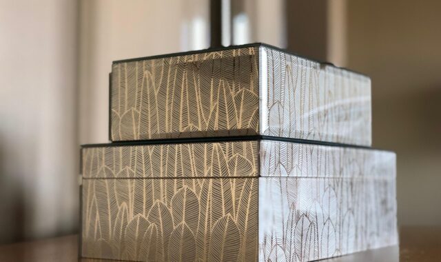
Soft-touch finishes, embossed patterns, click closures, magnetic caps, peel-back reveals and textured labels can make packaging feel more interactive. Amcor’s beauty packaging trend material has highlighted sensory packaging, metallic effects and tactile experiences as ways to make products more engaging. For beauty, these details matter because application is already a sensory ritual. The pack can set up that ritual before the product touches skin or hair.
Characters, illustration and micro-copy
Characters and illustration can make beauty packaging feel more human, humorous or collectible. Micro-copy can add personality when it also helps the user, such as a short instruction, shade mood or usage cue. The line between charming and childish depends on the target audience, price point and category. A playful illustration system can still feel sophisticated if it is controlled, ownable and connected to the formula story.
The business case for fun packaging design
The case for playful packaging is strongest when it supports clear commercial and communication goals. Beauty is crowded, and many categories contain products with similar claims, formats and price ranges. Packaging can help a product communicate difference before a shopper has time to compare ingredients or reviews.
Mintel’s 2026 beauty packaging analysis points to visually appealing packaging as a meaningful purchase driver, especially among younger consumers. It also notes that design, collectability and storytelling are being used to raise perceived value and strengthen loyalty. Those observations match a common market reality: a distinctive product is easier to remember, share and return to.
When playful packaging is well executed, it can deliver several practical advantages:
- Faster recognition: strong colours, shapes or icons help shoppers identify a product quickly across shelves, thumbnails and social posts.
- Higher shareability: unusual formats and reveal moments can encourage unboxing content without relying only on paid promotion.
- Emotional connection: humour, nostalgia, collectability and tactility can make a product feel more personal.
- Range building: a playful system can support shade extensions, limited editions and seasonal drops while keeping brand recognition intact.
- Bathroom-shelf value: consumers are more likely to display packaging that feels decorative, expressive or premium.
The important point is that fun should serve a purpose. If a design cannot explain what the product is, why it belongs to the brand or how it should be used, its entertainment value may not translate into lasting value.
Where playful packaging can go wrong
Fun packaging design carries risks because attention can be mistaken for effectiveness. A product may gain quick visibility but still underperform if the pack creates confusion, waste or disappointment.
Novelty that hides the product
Beauty shoppers still need basic information. They want to know the product type, shade, finish, skin or hair suitability, size, use instructions and key claims. If playful graphics or sculptural forms make that information hard to find, the design may slow the purchase decision rather than support it.
Over-packaging and sustainability tension
A playful unboxing experience can easily become excessive material. This matters more as regulation and consumer expectations move toward recyclability and waste reduction. The Council of the European Union has reported that the EU generated almost 186.5 kilograms of packaging waste per person in 2022, including 36 kilograms of plastic packaging. In that context, decorative excess is harder to defend, especially for beauty products that already use multiple components.
Refill systems that are attractive but inconvenient
Refillable beauty packaging can be playful, premium and collectible, but convenience remains a barrier. Mintel has reported only modest growth in US refillable beauty launches between 2022 and 2024 and identified convenience, logistics and cost as challenges. A beautiful refill compact or jar will not change behaviour if refills are difficult to buy, messy to install or unclear to recycle. See also: Beauty Ingredients.
Short-lived trends
Packaging designed only around a fast social trend can age quickly. A more durable approach is to identify the emotional code behind the trend. Nostalgia, surprise, tactility and self-expression are longer-lasting ideas than one viral colour or meme format.
A practical framework for beauty brands
Beauty teams can make playful packaging more disciplined by treating fun as a design system rather than an isolated visual style. The following framework helps separate useful playfulness from decorative noise.
| Design decision | Useful question | Common risk |
|---|---|---|
| Colour | Does it help recognition, shade navigation or mood? | Low contrast, poor readability or trend-led sameness |
| Shape | Is the silhouette distinctive and comfortable to use? | Instability, leakage, difficult storage or high tooling cost |
| Texture | Does touch improve the product ritual? | Finishes that reduce recyclability or attract dirt |
| Copy | Does the voice clarify or delight? | Jokes that obscure instructions or claims |
| Unboxing | Does the reveal add meaning without excess material? | Wasteful inserts, layers or oversized cartons |
| Refillability | Is the refill easy to find, install and understand? | A premium object with a weak repeat-use system |
A useful test is to remove the logo from the pack and ask whether the product is still recognizable as part of the same world. If the answer is yes, the playful design system is doing more than decorating. It is building brand memory.
Sustainability and regulation are now part of the design brief
In Europe, playful packaging now has to be considered alongside stricter packaging policy. Regulation (EU) 2025/40, the Packaging and Packaging Waste Regulation, entered into force on 11 February 2025 and applies from 12 August 2026. EUR-Lex and European Commission guidance state that the regulation covers packaging and packaging waste across materials and introduces requirements across the packaging life cycle.
For beauty brands selling in or designing for the European market, the direction is clear. The European Commission describes the goal of making all packaging on the EU market recyclable in an economically viable way by 2030. The regulation also introduces recyclability performance grading from 2030 and a stronger requirement for packaging to be recyclable at scale from 2035. This does not ban creativity, but it changes the boundaries of responsible creativity.
Designers should therefore consider recyclability early, not after a playful concept has already been approved. Complex mixed materials, excessive metallisation, difficult-to-separate components and decorative add-ons may create problems if they interfere with sorting or recycling. The more playful the pack, the more important it becomes to show that the playfulness does not undermine material recovery, refill use or clear disposal instructions.
The best future direction is not less imagination. It is smarter imagination: mono-material structures where possible, refill systems that users can understand, decoration that does not block recyclability, and clear labelling that fits naturally into the visual system.
How to use fun packaging design with credibility
For beauty brands, fun packaging works best when it starts with a clear brand truth. A playful Gen Z makeup brand, a sensorial body care line, a nostalgic fragrance collection and a family-friendly bath product can all use fun differently. The design should not simply copy what is trending on social platforms.
A credible process might begin with three questions:
- What emotion should the product own? Joy, calm, confidence, nostalgia, curiosity and indulgence require different visual languages.
- What behaviour should the pack encourage? Display, refill, collect, share, gift or repurchase each need different design choices.
- What must remain simple? Opening, dispensing, reading instructions, identifying shades and disposing of components should not become harder because the design is playful.
The key shift is that beauty packaging is being asked to do two things at once. It must be more expressive because products compete in image-heavy environments. It must also be more responsible because packaging waste, recyclability and refill systems are under closer scrutiny. Fun packaging design succeeds when it can hold those demands together.
Frequently asked questions
What is fun packaging design in beauty?
It is packaging that uses playful visual, tactile or interactive elements to create recognition and emotional appeal. In beauty, this can include bold colour, unusual silhouettes, satisfying closures, collectible graphics, reveal moments, humorous copy or decorative refill systems. The design still needs to protect the formula and communicate clearly.
Is playful packaging only for younger consumers?
No. Younger consumers may be especially active on visual and social platforms, but playful packaging can appeal across age groups when it connects with the product and brand. Luxury fragrance, premium skincare and body care can all use controlled playfulness through form, tactility and ritual rather than cartoon-like graphics.
Can fun packaging design be sustainable?
Yes, but it requires early material planning. A playful pack can use recyclable structures, refillable systems, lightweighting, clear sorting labels or reusable components. Problems arise when fun depends on unnecessary layers, hard-to-separate materials or decorative finishes that reduce recyclability.
How can a beauty brand avoid gimmicky packaging?
The simplest test is whether the playful element improves recognition, use, storytelling or repeat purchase. If it only creates a quick surprise and makes the product harder to use, store, refill or understand, it is likely a gimmick.
What should designers check before approving a playful pack?
They should check formula compatibility, dispensing, legibility, accessibility, shelf stability, e-commerce photography, refill or recycling instructions, transport durability and likely regulatory requirements in target markets. A fun idea should survive real use, not just look good in a concept render.