Wine packaging design for a market shaped by sustainability and clearer labels

a[data-rs-seo-link]{text-decoration:underline!important;color:#1a56db!important;cursor:pointer!important;}a[data-rs-seo-link]{text-decoration:underline!important;color:#1a56db!important;cursor:pointer!important;}
Why wine packaging design is changing
Wine packaging design is no longer only about making a bottle look premium on shelf. It now has to balance brand recognition, transport weight, recycling expectations, label space, online visibility and changing drinking occasions. The pressure is commercial as well as environmental. In its May 2026 overview, the International Organisation of Vine and Wine reported that global wine consumption in 2025 was estimated at 208 million hectolitres, down 2.7% from 2024 and 14% below 2018. In a softer market, packaging has to explain value quickly, avoid unnecessary cost and give buyers practical reasons to trust the product.
For designers, the first question is not simply what the label should look like. It is what job the whole pack must do. A traditional glass bottle, a lightweight bottle, a can and a bag-in-box format each set different expectations before the first line of copy is read. A sound design process starts with the format, then builds the label system, finish, claim language and compliance space around that choice.
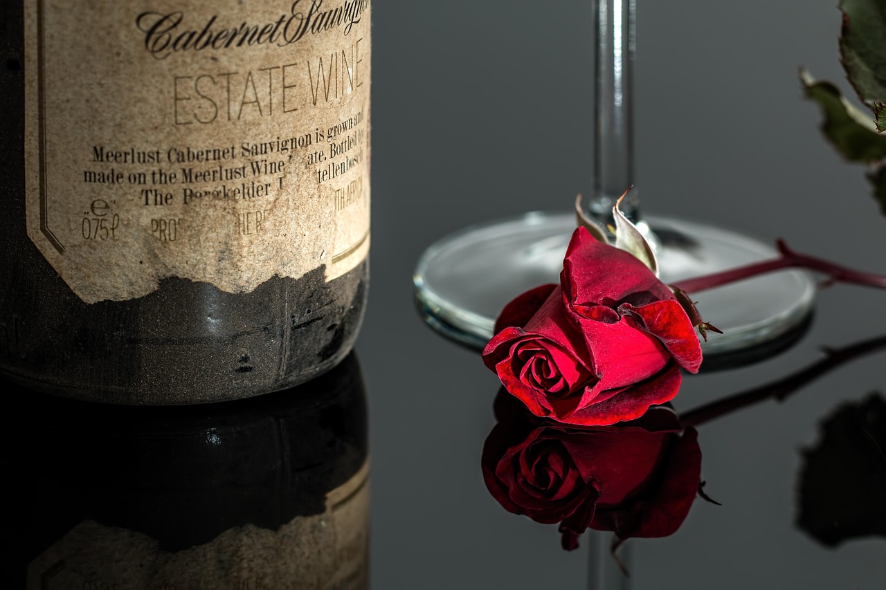
Seen within wider Packaging Design practice, wine packaging is a useful example of how material, structure and information hierarchy now have to work together.
The format decision comes before the graphics
The wine category still relies heavily on glass because it protects the product, signals tradition and suits gifting, restaurants and cellaring. But glass is not one design answer for every occasion. The Sustainable Wine Roundtable has argued that glass bottles can account for a large share of a wine’s total carbon impact, mainly through manufacturing and transport. Its Bottle Weight Accord asks signatories to move the average weight of 750ml still wine bottles below 420g, compared with a commonly cited average around 550g.
That does not make every alternative format automatically better. Design should match the drinking occasion. A cellar-worthy red, a sparkling wine and a festival-ready single serve have different needs. A premium estate wine may need the ceremony and reassurance of glass; a casual picnic wine may benefit from a can; an everyday at-home wine may be more credible in bag-in-box if the design explains freshness, serving convenience and value clearly.
| Format | Design opportunity | Main limitation to manage |
|---|---|---|
| Lightweight glass bottle | Keeps familiar wine cues while reducing material weight | Must avoid looking cheaper if the brand previously used heavy glass |
| Standard or premium glass bottle | Strong for gifting, fine wine, restaurants and cellar cues | Higher material and transport impact, especially with very heavy bottles |
| Aluminium can | Portable, portion-controlled and suitable for casual occasions | Needs careful typography and colour to avoid looking like soft drink or hard seltzer |
| Bag-in-box | Large printable area, value communication and longer freshness after opening | Consumer perception can be mixed, so quality reassurance is essential |
| Paper-based or PET bottle | Lightweight structure and strong sustainability story when evidence supports it | Requires clear shelf-life, recycling and product-positioning communication |
Lightweight glass can still look premium
One of the most persistent wine packaging myths is that heavier glass always means better wine. Weight can signal luxury in the hand, but it does not, by itself, improve the liquid. The design challenge is to replace that psychological cue with more meaningful signals: proportion, label paper, restrained finishes, typography, closure quality and coherent storytelling.
A lighter bottle can still feel premium if the visual system is deliberate. The shoulder shape, punt depth, glass colour and label size should feel intentional rather than cost-cut. A Burgundy-style silhouette may suggest softness and tradition, while a high-shouldered Bordeaux shape can feel structured and classic. Designers can also use embossing selectively, but heavy decorative glass should be questioned if it adds material without improving recognition or functionality.
Capsules deserve the same scrutiny. A capsule can complete a traditional silhouette and protect the closure visually, but some brands now remove capsules to reduce materials and signal lower-waste intent. That choice needs to fit the brand. On a natural wine label, a capsule-free neck may feel honest and modern; on a formal gift wine, it may feel unfinished unless the closure and neck label are carefully designed.
Labels need faster hierarchy and more useful information
Wine labels have often relied on romance: estate names, landscapes, crests and vintage cues. Those cues can still matter, but the label now has to perform in smaller and faster environments, including supermarket shelves, mobile search, delivery apps and social feeds. A front label should establish the brand, wine type and emotional cue within seconds.
A practical hierarchy often works like this: brand or producer first, wine style second, origin and vintage third, then proof points such as organic certification, low-intervention positioning or serving cues. If the buyer has to rotate the bottle several times to understand whether the wine is dry, sparkling, chilled, light-bodied or suitable for a meal, the design is asking too much.
The back label should not be treated as leftover space. It is where trust is built. Plain-language tasting notes, serving temperature, food pairing, closure information and responsible disposal instructions can be more useful than long poetic copy. QR codes can add depth, but they should not hide information that consumers need at the point of purchase. In the UK, official wine labelling guidance still requires attention to mandatory details such as product category, provenance where relevant and allergen statements; wines with sulphites above specified thresholds require a clear “contains” statement. Designers should confirm requirements for each target market before artwork is finalised.
Sustainability claims need evidence, not decoration
Green colour palettes, leaf icons and kraft paper are not sustainability strategies. They are visual signals, and they can mislead if the underlying material choices do not support them. The European Union’s Packaging and Packaging Waste Regulation, in force since 11 February 2025 and applicable from 12 August 2026, has made packaging design a more regulated circularity issue for brands selling into the EU. Its direction is clear: less unnecessary packaging, better recyclability and more consistent information for sorting.
For wine packaging design, sustainability claims should be specific. “Lightweight 420g bottle,” “made with recycled glass where available,” “no capsule,” or “box separates for recycling” tells buyers more than vague wording such as “eco-friendly.” If a claim depends on local recycling infrastructure, say so carefully. If a material is lighter but difficult to recycle in a target market, the design team should not present it as a simple environmental win. See also: Beauty Ingredients.
Bag-in-box is a good example of the nuance required. Academic research published in 2024 in the Australian Journal of Grape and Wine Research noted that alternative wine formats such as bag-in-box can perform better environmentally and economically than traditional glass in some contexts, but consumer attitudes remain mixed. This is where design can help shift perception: strong product photography, clear varietal information, premium typography and visible freshness messaging can make the format feel intentional rather than downmarket.
Premium cues are becoming quieter and more specific
Premium wine packaging does not need to shout. In many current designs, quality is communicated through restraint: generous white space, one distinctive typeface, tactile paper, a limited colour palette and one memorable graphic device. The goal is not minimalism for its own sake. It is recognisability at a distance and credibility up close.
There is also a move from generic luxury to specific identity. A wine from a coastal region can use texture, colour and form to suggest wind, salt or stone without relying on cliché. A women-led estate, a regenerative vineyard or a low-intervention producer can express its difference through copy tone and material choices, but the claim should be factual and verifiable. Packaging should not invent a story the producer cannot support.
Finishes need discipline. Foil, embossing, debossing, screen printing and unusual die cuts can all be effective, but each should have a job. A small foil mark may help a label catch light on shelf. A textured stock may support an artisanal positioning. Too many finishes can make the pack expensive, harder to recycle and visually confused. In a market where many consumers are more price-sensitive, excess decoration can also feel out of step.
A practical checklist for wine packaging design
Before moving into final artwork, design teams should test the pack against the decisions that most affect performance. The checklist below is intentionally practical because wine packaging mistakes are often caused by solving the label before solving the pack.
- Define the occasion. Is the wine for gifting, cellaring, everyday meals, outdoor drinking, restaurants or e-commerce delivery?
- Choose the format before the finish. Decide whether glass, lightweight glass, can or bag-in-box best fits the occasion and price point.
- Control the first three seconds. Make producer, wine style and key cue visible without requiring close reading.
- Keep claims specific. Replace vague sustainability language with measurable or clearly explained packaging choices.
- Design the back label as a trust tool. Use it for serving guidance, origin, allergens, disposal cues and concise product context.
- Check market rules early. UK, EU, US and export-market labelling requirements can differ, and future alcohol labelling rules may change.
- Prototype the real object. A label that works flat on screen can fail on curved glass, textured paper, chilled cans or large box panels.
- Test shelf and thumbnail views. Wine is bought both in-store and online, so the pack must be readable as a physical object and as a small image.
Frequently asked questions
What makes wine packaging design effective?
Effective wine packaging design makes the wine easy to understand, credible for its price and appropriate for its occasion. It should communicate producer, style, origin and key value cues quickly, while leaving enough space for mandatory labelling and practical consumer information.
Is lightweight glass bad for premium wine branding?
No. Lightweight glass can work for premium wine if the rest of the design system carries the quality cues. Proportion, paper choice, print quality, typography and storytelling can replace the outdated assumption that a heavier bottle automatically means a better wine.
Are cans and bag-in-box formats suitable for serious wine?
They can be, but they need honest positioning. Cans are strong for portability and single-serve occasions, while bag-in-box works well for at-home consumption and freshness after opening. For fine wine, long ageing or formal gifting, glass may still be the better design choice.
How should wine brands communicate sustainability on packaging?
Brands should use specific, evidence-based statements rather than broad green claims. Material weight, recyclability, recycled content, capsule removal and separation instructions are clearer than generic words such as “natural” or “eco.” Any claim should be checked against the rules in the market where the wine is sold.
What is the biggest mistake in wine packaging design?
The biggest mistake is treating the label as decoration after the packaging format has already been chosen. Strong wine packaging starts with the consumer occasion, material choice, regulatory space and brand positioning, then uses graphics to make those decisions clear and desirable.